
Challenge
When I started Firestain back in 2008, I was not expecting to be be slammed with work right off the bat. So I must admit I was taken a little by surprise and ended up having to scramble to make up invoices and business cards. I guess one can’t really complain about being too busy with new clients to attend to your own design needs.
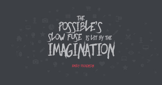
Anyway, the Firestain brand was thrown together in a really short space of time. Ironic–I know, considering my profession. It was just simple and clean though and served it’s purpose. But really – let’s be honest here. A freshening up was due a long, long time ago. Well, finally it’s done
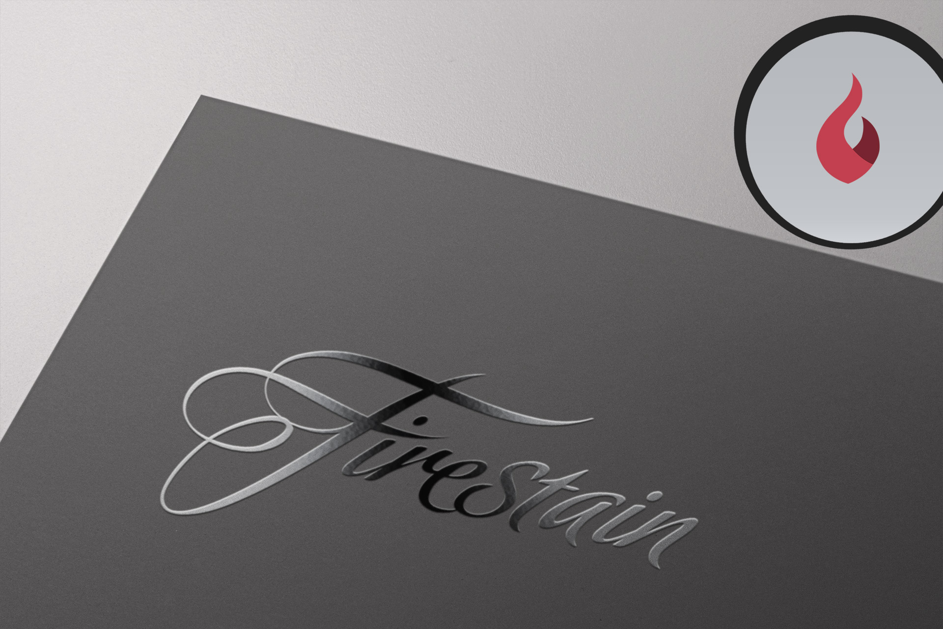
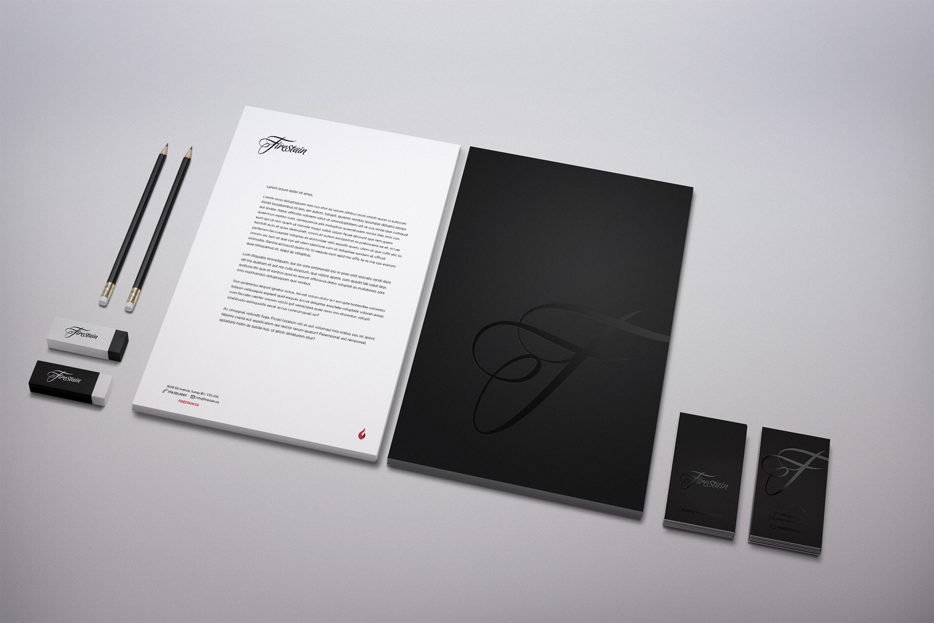
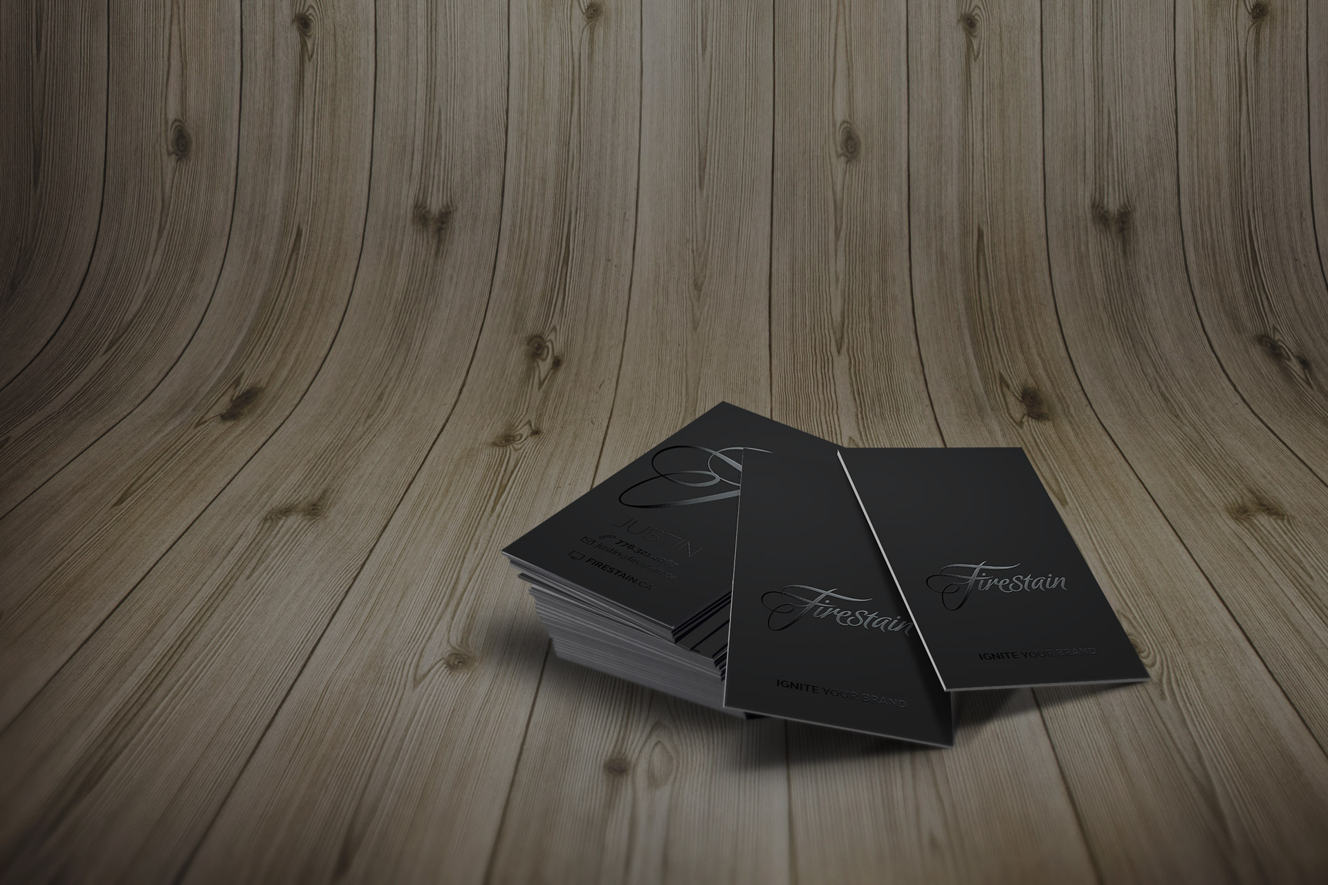
I decided to keep it a typographical logo with a script. I spent hours pouring over different typefaces but none had the mix of flair and legibility that I wanted. I ended up using an uppercase ‘F’ from a more ornate face, and found another script face that I really liked, but it was heavily ‘grungified’, with a chalk-like texture. I redrew the letters with clean lines and put the two together to produce an easily legible, but elegant piece of typography.
I decided on using black on black to add a dramatic, and classy element. Black foil on an uncoated black gives a really sexy look and feel. The brighter red of the previous design was replaced with a more muted red, adding a softer, more contemporary feel. Finally, a flat-design, icon-styled flame was introduced as a secondary graphic element.
Long overdue? Definitely. Lot’s of fun to put together? Absolutely. And this website was the final spark to re-ignite the Firestain brand.

